something about me
name: anty
about me:
see all
film reviews
  • sophie's revenge
  • shinjuku incident
  • kakera
  • breathless
  • grotesque
  • the message
  • possessed
  • slice
  • the founding of a republic
  • identity
  • castaway on the moon
  • sawako decides
  • confessions
  • memories of matsuko
  • ip man 2
  • the man from nowhere
  • cyrano agency
  • the stool pigeon
  • haunters
  • a little thing called love
  • wind blast
  • midnight fm
  • villain
  • shaolin
  • in the realm of the senses
  • empire of passion
  • red light revolution
  • the front line
  • my way
  • arirang
  • sunny
  • romancing in thin air
  • you're the apple
  • vulgaria
  • the woodsman...
  • love in the buff
  • river
  • songlap
  • already famous
  • the great magician
  • song of silence
  • moby dick
  • dangerously excited
  • the man behind...
  • dragon
  • back to homepage
  • rants and ramblings
  • the dream within
  • the hopeless tomorrow
  • bulgarians vs turkish
  • poetry event
  • 3 quarts & the truth
  • back to homepage
  • art and design
  • events reflections
  • noea design portfolio
  • magazine covers
  • disability advert
  • back to homepage
  • links
  • cueafs
  • cine-vue
  • icov
  • nadia baird
  • the blog of dros
  • back to homepage
  • 131mc Magazine Project Covers
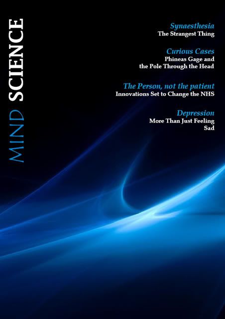
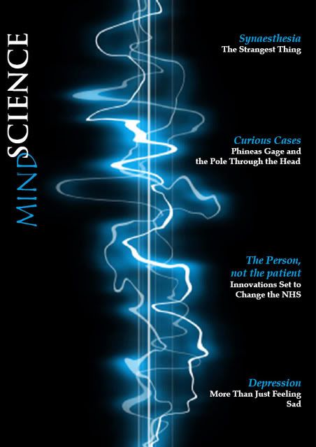
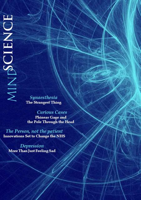
    This is my first truly fascinating encounter with InDesign. I had tried to use the program before, but with the lack of an interesting project, I quickly gave up on it. Our magazine project presented an opportunity for me to utilise my design skills and to portray my vision for our psychology/science magazine idea.

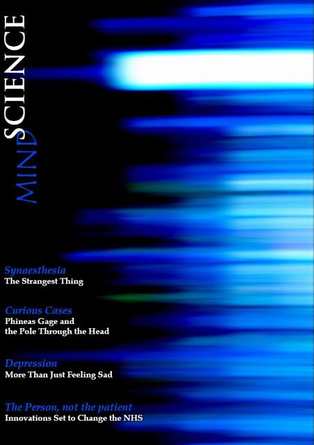
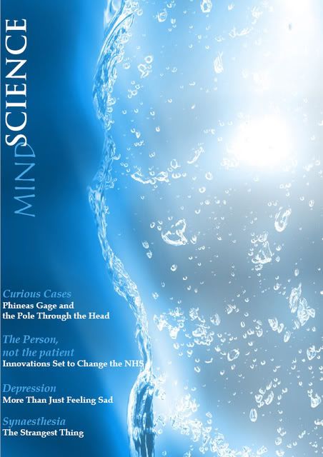
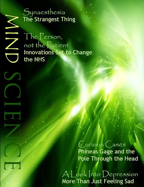
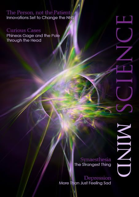
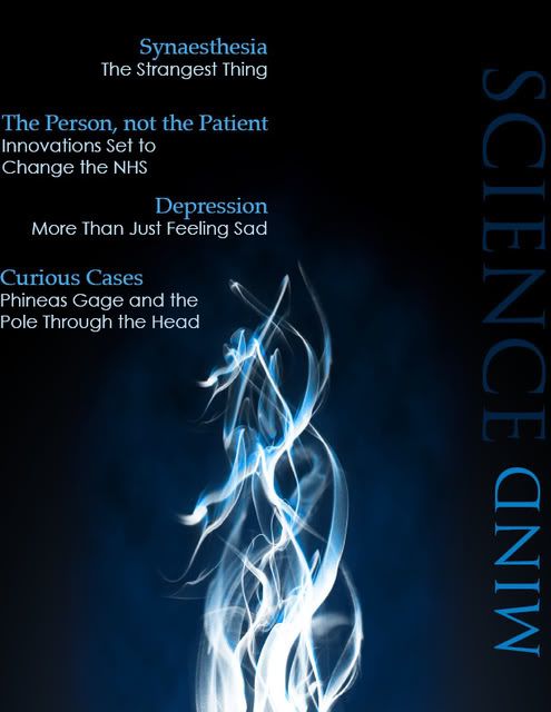
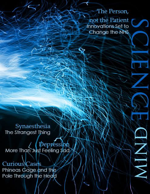
    Since the program was quite easy and the internet was full of marvellous imagery, suitable for our product, I played around with the design and did 9 possible covers. My personal favourites were 3, 5 and 7 (plus the last one, although it presented quite a detailed image, which made a too 'complicated' or 'crowded' cover). As a group, we finally decided to use number 7, as our magazine is designed for laymen and not professionals, and the colour blue is usually used to very scientific magazines, whilst purple is a little more neutral. Plus, as we were targeting mostly women with an occasional interest in psychology and science, we decided purple was a more suitable colour for a female audience than blue is.

    Number 1

    Number 2

    Number 3

    Number 4

    Number 5

    Number 6

    Number 7

    Number 8

    Number 9

    Labels:

    created by: anty  


    0 comments


    < leave a comment

    < < back to homepage
     
    university tasks
  • 100mc weekly tasks
  • 101mc summer task
  • 101mc other tasks
  • 122mc media projects
  • 130mc news articles
  • 132mc broadcast portfolio
  • 201mc experience
  • 205mc presentations
  • 230mc rao magazine
  • 231mc radio show
  • 241mc press conference
  • 305mc seminar tasks
  • 307mc final project
  • 332mc news articles
  • 332mc magazine show
  • add+vantage presentation
  • back to homepage
  • cueafs newsletter
  • issue 1
  • issue 2
  • issue 3
  • back to homepage
  • cueafs articles
  • cueafs is back and better
  • adam torel interview
  • cueafs goes pro
  • zipangu welcomes cueafs
  • zipangu fest for japan
  • lee yong-ju interview
  • italy welcomes cueafs
  • cueafs feature
  • segawa masaharu interview
  • jang jin interview
  • mamat khalid interview
  • koji maeda interview
  • terracotta donation
  • cecil angel cup
  • east winds preview
  • back to homepage
  • cueafs at the udine far east film festival 12
  • right before udine
  • cueafs in udine day 5
  • cueafs in udine day 6
  • cueafs in udine day 7
  • cueafs in udine day 8
  • udine overall reflection
  • back to homepage
  • cueafs at the udine far east film festival 13
  • cueafs in udine day 5
  • cueafs in udine day 6
  • cueafs in udine day 7
  • cueafs in udine day 8
  • back to homepage